Objective
Bright Horizons was seeking to improve one of their many child care lead generation processes by iterating on their center location tool. The old experience was unfriendly to mobile devices, lacked clarity in areas where there are a lot of child care centers, and wasn't built on a system that could be updated easily.
Solution
Our solution came in three parts:
- Create a map powered by Google Maps following the industry standard on location services.
- Improve the design to better service desktop and mobile devices regardless of screen size.
- Provide essential details on click or tap for quicker information access.
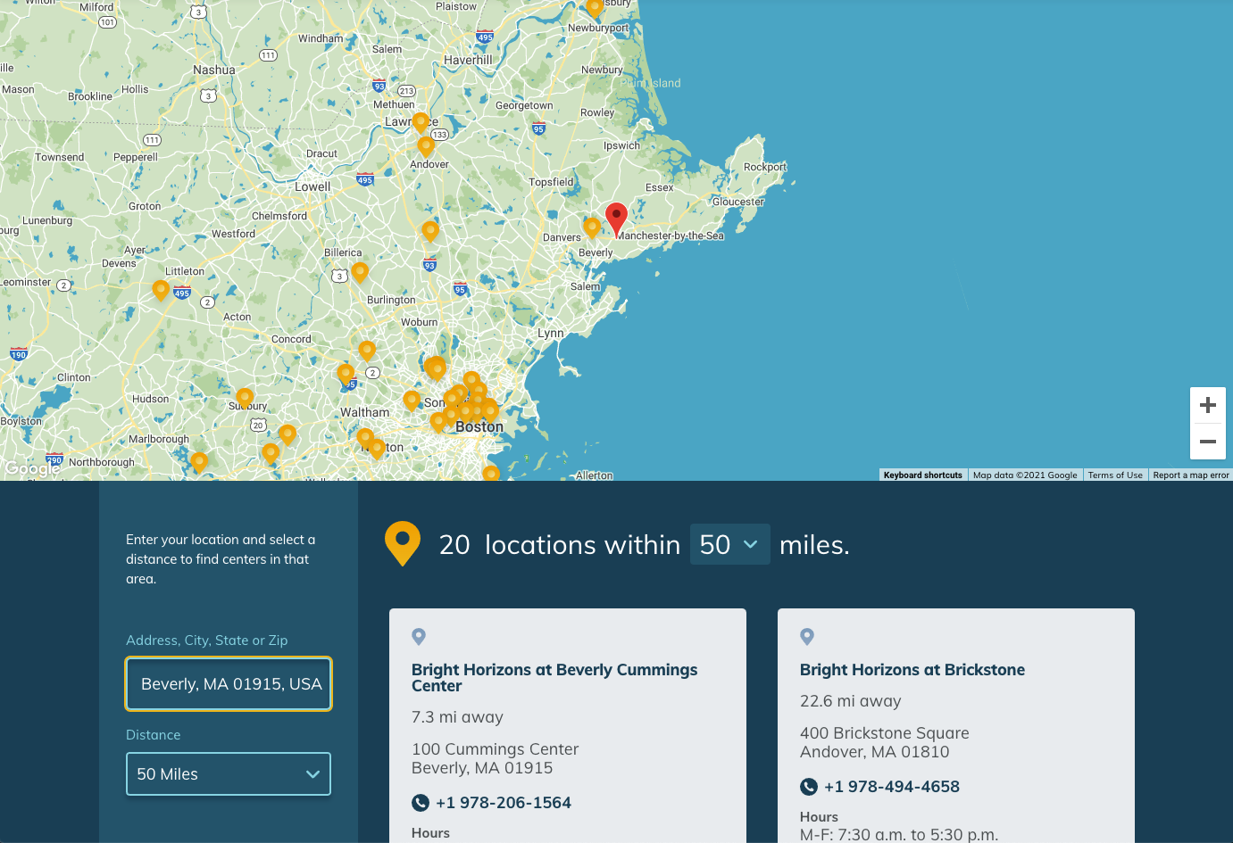
Process
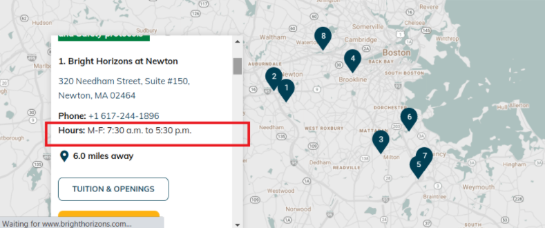
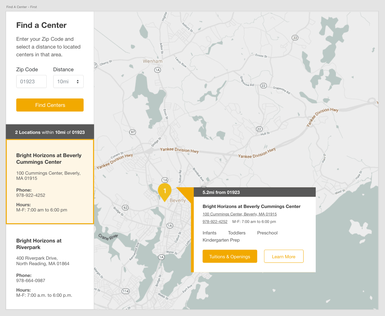
Due to its archaic design, the hardest part about choosing where to iterate on the Center Locator tool was determining which improvement would make the most impact to their large user base. The existing tool was forcing users to locate their nearest location via a massive full screen map with a tiny zip code overlay panel that when queried would serve an infinite scrolling results list that was difficult to use. Moreover, the entire user interface did not scale down to mobile so users on their phones were met with a horizontal scrolling mess.
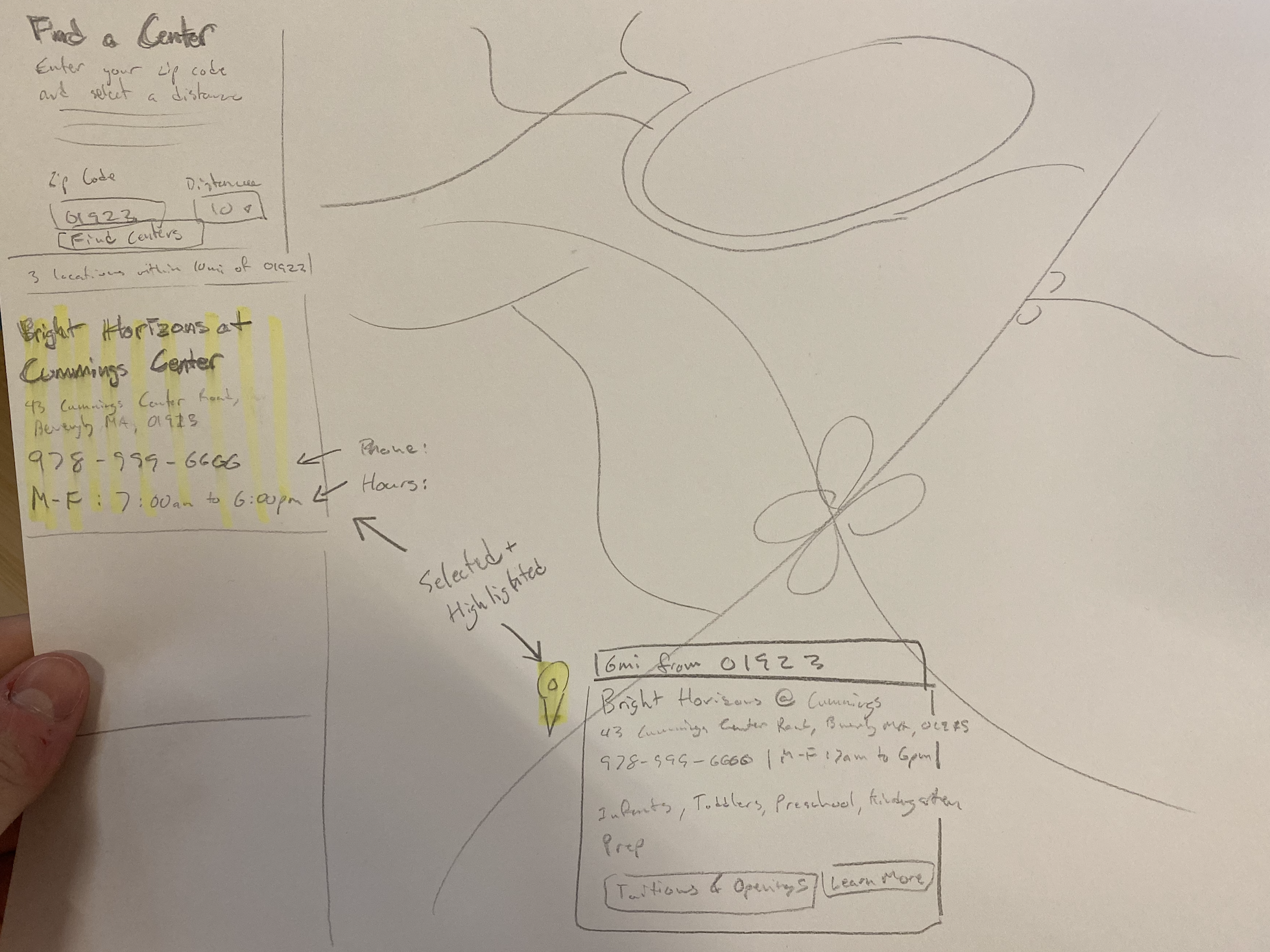
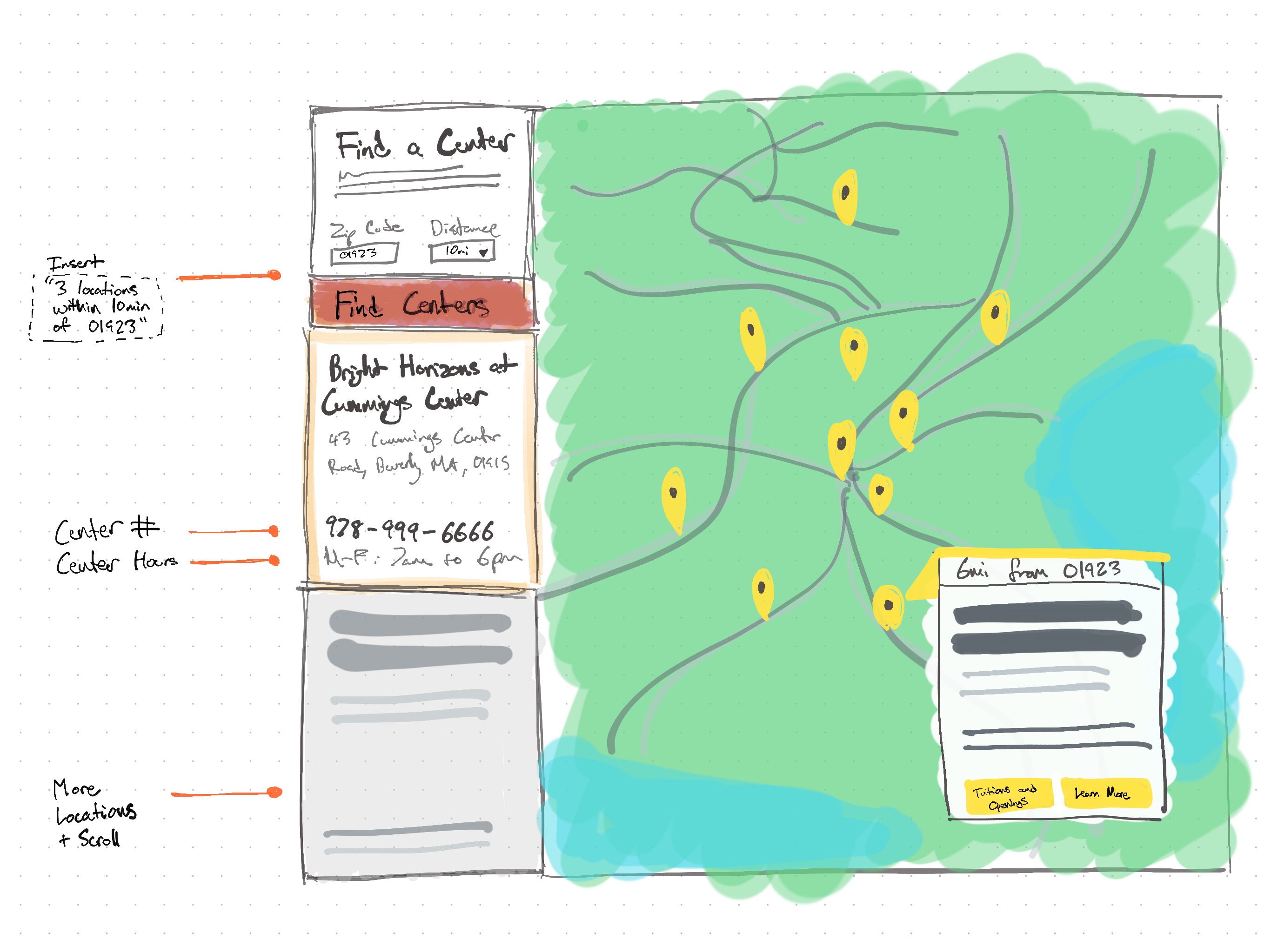
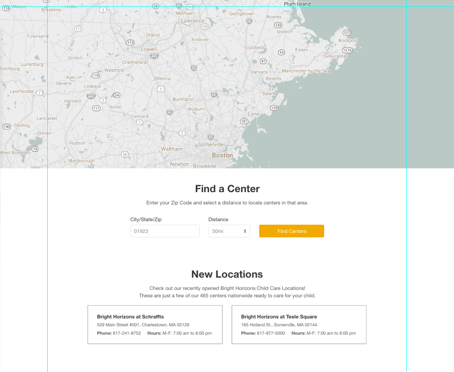
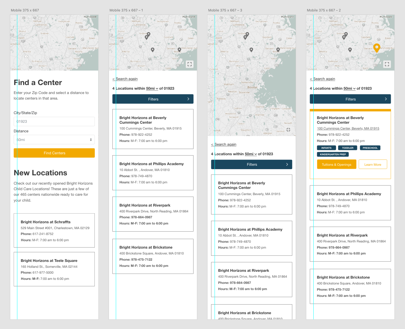
We chose to iterate the design in a way that would ensure the largest possible audience could use the tool regardless of which device they were on. To us, that would be a design that was highly usable and mobile-first. Our thinking led us to separating the search and results list from it’s old location, siting on the map in an overlay along the side, and instead run both parts of the UI in a split-screen like design. This would enable users to maximize their screen real estate by prioritizing the new Google Maps integration being built in.
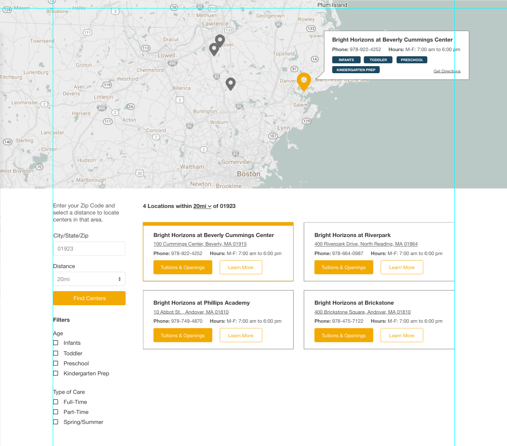
We then pushed our designs further to compliment the pin system that already existed. Users on the internet today who use maps are familiar with the mental model of pins and we wanted to extracting supporting information from pins that would normally clog search results. By adding key pieces of information that sprouted from the pins we took what started as a simple search and location experience and turned it into a more contexual map.
We experimented with search and results being shown along the side of the screen by sharing the designs with parents in the office, but ultimately choose to run both along the bottom of the window in a drawer to ensure the design was as usable as we could make it. Intitally we had added steps to the experience with an introductory landing page, but we abandoned this effort as we were requiring too many clicks to see search results from a user as they could now immediately search for their location on landing or quickly choose a pin. Additionally, by presenting multiple cards already on screen along with basic filters the user would have maximum control without detracting from their initial purpose of visit.
Our last bit of validation came when we saw how the mobile wireframe prototypes could still operate naturally as a map, and the search and results page didn't disrupt from the overall goal of finding a center.
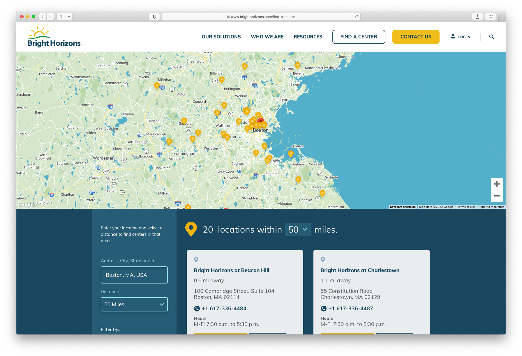
Result
The live version of the new Center Locator tool can be seen here. This improved tool enabled Bright Horizons to better display the locations of their child care centers, highlight for their users only essential information about each one, and streamlined their lead collection experience.
Appendix
Process images can be seen below.
Related Work From This Client
- 2022 - Resource Aggregator
- 2020 - New Homepage
- 2019 - Single Page Lead Form